Brand Guidelines & logo
The Meaning Behind Designott
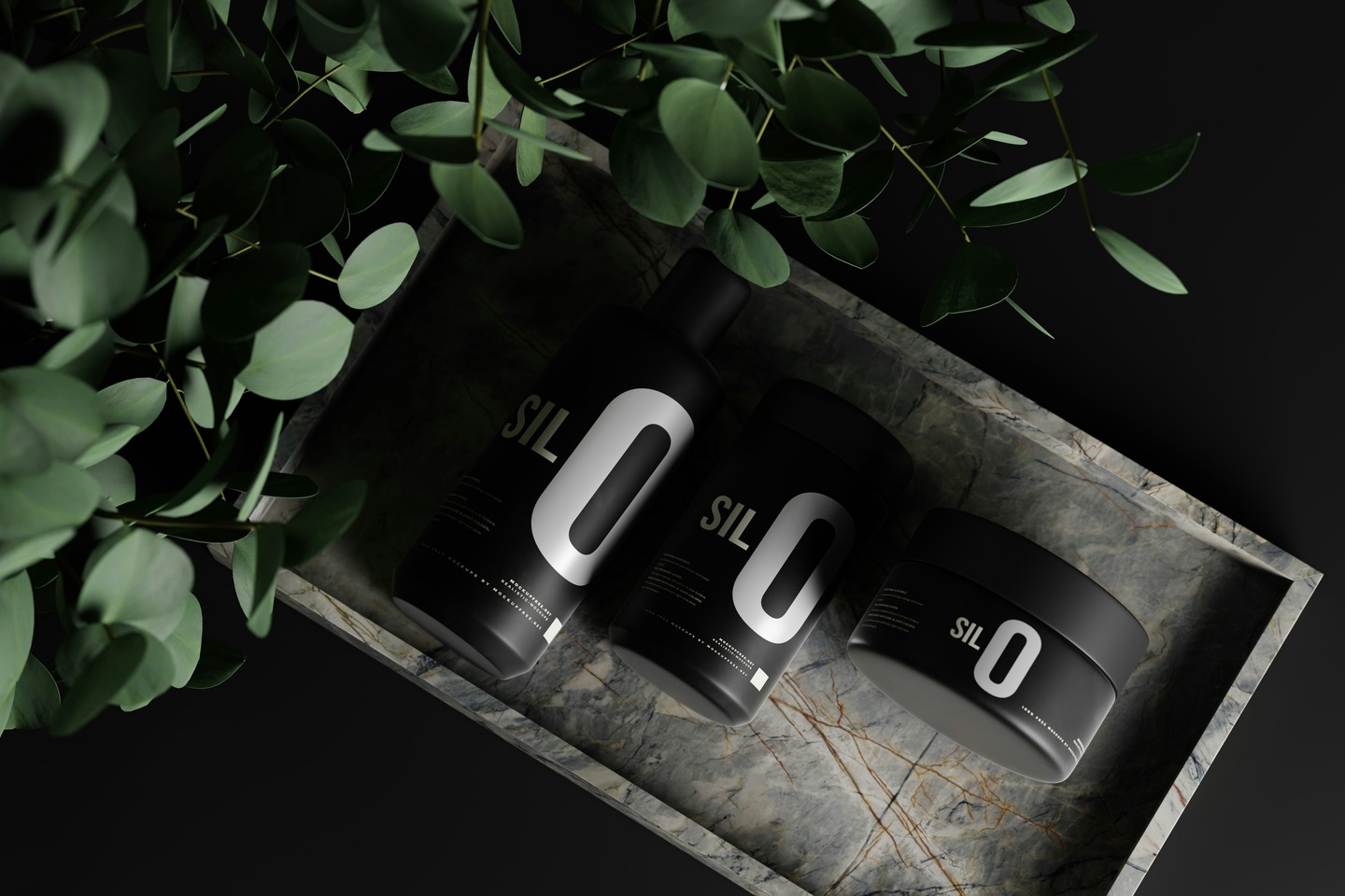
UrbanSpace has established itself as a leading provider of innovative urban living solutions, focusing on sustainable and stylish designs. However, as market trends evolved, the brand recognized the need to update its visual identity to better resonate with its target audience, which includes young professionals and environmentally conscious consumers.
Client :
Date :
Category :
Duration :
The Meaning Behind Designott
Every name has a story. Ours finishes yours.
Design isn’t just the beginning of our name—it’s the beginning of everything we do. It’s the strategy, the structure, and the soul behind every brand, campaign, and event we execute.
OTT stands for Over The Top—because we don’t do average. We don’t follow. We redefine. Our standard is extreme precision, high craft, and results that go beyond the expected.
And the “dott”?
Yes, it’s a dot. But not really. It’s a dott.
A bold, final punctuation. The kind of period that doesn’t just close the sentence—it owns it. When you see it, the job’s done. The message is clear. And there’s nothing left to say.
Logo Usage
The Designott logo comes in two official forms: the wordmark and the monogram (D symbol). Both are legally recognized and used across all corporate and official materials.
The wordmark is our primary and most essential identifier. It carries the full name “Designott,” and when people see it, they know who finished the job. It’s bold, clear, and uncompromising—just like our work. It’s what appears on legal documents, client-facing materials, and all brand-led communication.
The monogram is our "D" symbol—split vertically with red on the left, and black or white on the right, depending on the background. It’s not ornamental. It’s iconic. Used in tight spaces or high-impact placements like merchandise, social icons, stamps, and supporting graphics, it reinforces presence without saying a word.
This isn’t a flexible logo. It’s a definitive one. Once it's there, there’s nothing left to add.
This is the official, legal version of the Designott logo.
It includes both the “D” monogram and the full wordmark, and is used on:
Contracts and formal documents
Company profiles and brand decks
Signage, certificates, uniforms, and presentations
- Website headers and brand-led print material
Use when: Full representation and brand authority are needed.
The wordmark “Designott” is the most commonly used identifier. The wordmark is always in black or white, but the final “dott”—yes, with two t’s—is always red. Always. No exceptions.
Website footers and main headers
Business cards and email signatures
Merchandise, social banners, and digital ads
Any context where clarity and presence are key
Use when: You need a strong, readable logo without the icon.
The monogram is compact, powerful, and unmistakable.
It’s vertically split—red on the left, black or white on the right, depending on background.
Profile pictures, social avatars, and favicons
App icons and branded accessories
Watermarks, stamps, and event passes
Subtle brand marks in visual compositions
Use when: Space is limited, or when the brand speaks louder without words.
Challenges & Goals
Things to avoid
- 01. Understanding Client Vision
- 2. Balancing Client Input with Creative Expertise
- 3. Differentiating the Brand
- 4. Aligning with Target Audience Needs
- 5. Ensuring Scalability of the Brand
Objectives :
- 1. Establish a Strong and Unique Brand Identity
- 2. Increase Brand Awareness
- 3. Ensure Consistency Across Platforms
- 4. Build a Scalable Brand System
- 5. Simplify Brand Communication