The Dot That Ends It All: The Meaning Behind ‘Designott’
Every brand name has a story. Ours ends yours—with a full stop.
At first glance, Designott looks simple. Clean. Modern. But make no mistake—every letter, every accent, and every intention behind the name is deliberate. We don’t just “do design.” We start with it. We finish with it. And when we’re done, there’s nothing more to add.
Let’s break it down.
Design.
It’s not just what we do—it’s where everything begins.
Branding? Starts with design.
Advertising? Rooted in design.
Events? Built from the ground up with design.
Design is the foundation, the strategy, and the structure behind everything we execute. Without design, there’s no clarity, no message, and definitely no impact. For us, it’s the first step. Always.
OTT – Over The Top.
We’re not subtle about it—we’re proud of it.
OTT stands for Over The Top, and it defines how we work. We don’t do average. We don’t aim to blend in. We aim to stand out. Whether it’s a 3-meter-wide roof sign or the voice behind a brand launch, we go further. Louder. Smarter.
You don’t hire Designott for the ordinary. You hire us to disrupt it.
The “Dott.”
Now let’s talk about the one detail that most people glance over—and that’s exactly why we love it.
Yes, it’s a dot. But in our world, it’s a dott. Two t’s, not one. Why? Because it’s more than punctuation. It’s finality. It’s precision. It’s the end of the sentence. The full stop.
When a project is signed off with our name—when you see that red dott—you know the job is done. No fluff. No unfinished thoughts. No “we’ll fix it later.”
Designott is the last touch your project needs. And once we’re in, there’s no need for anyone else.
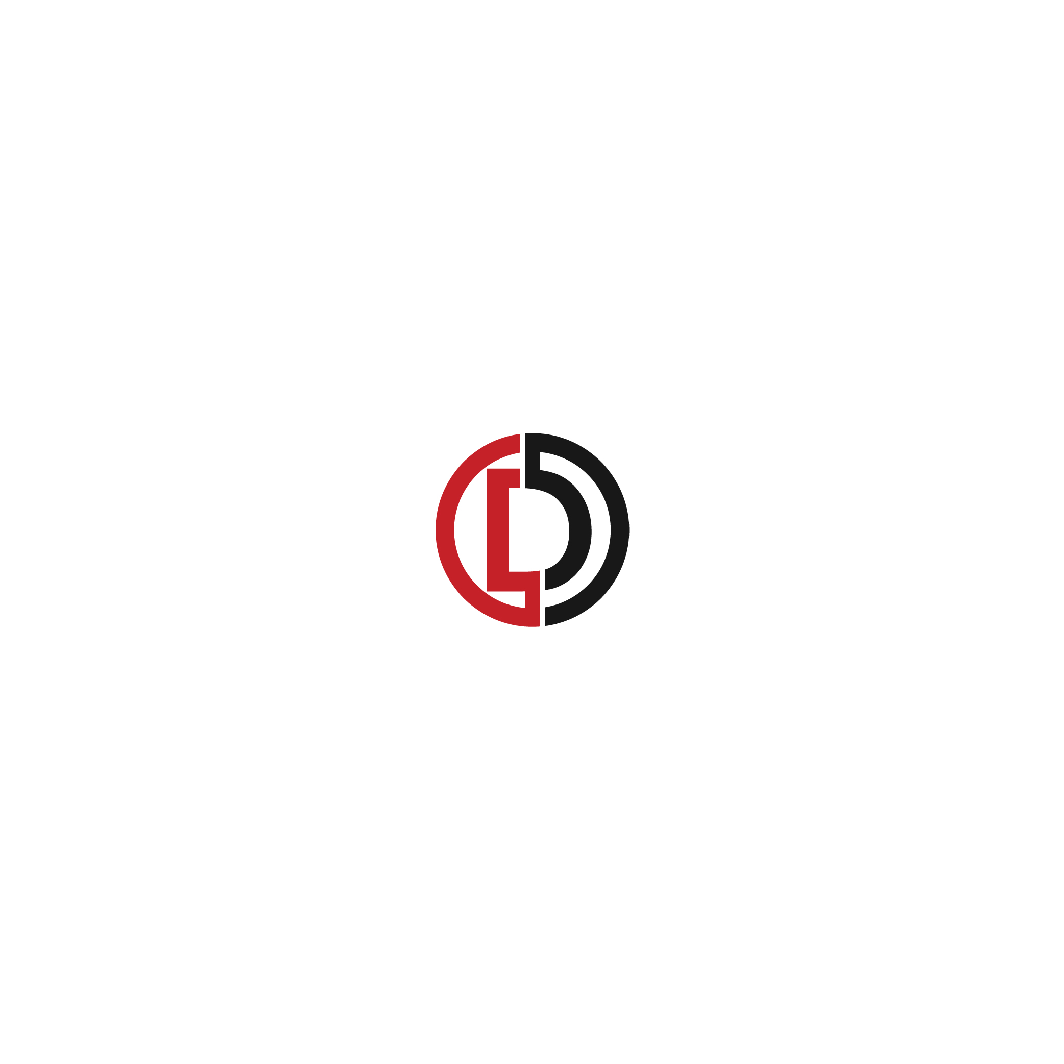
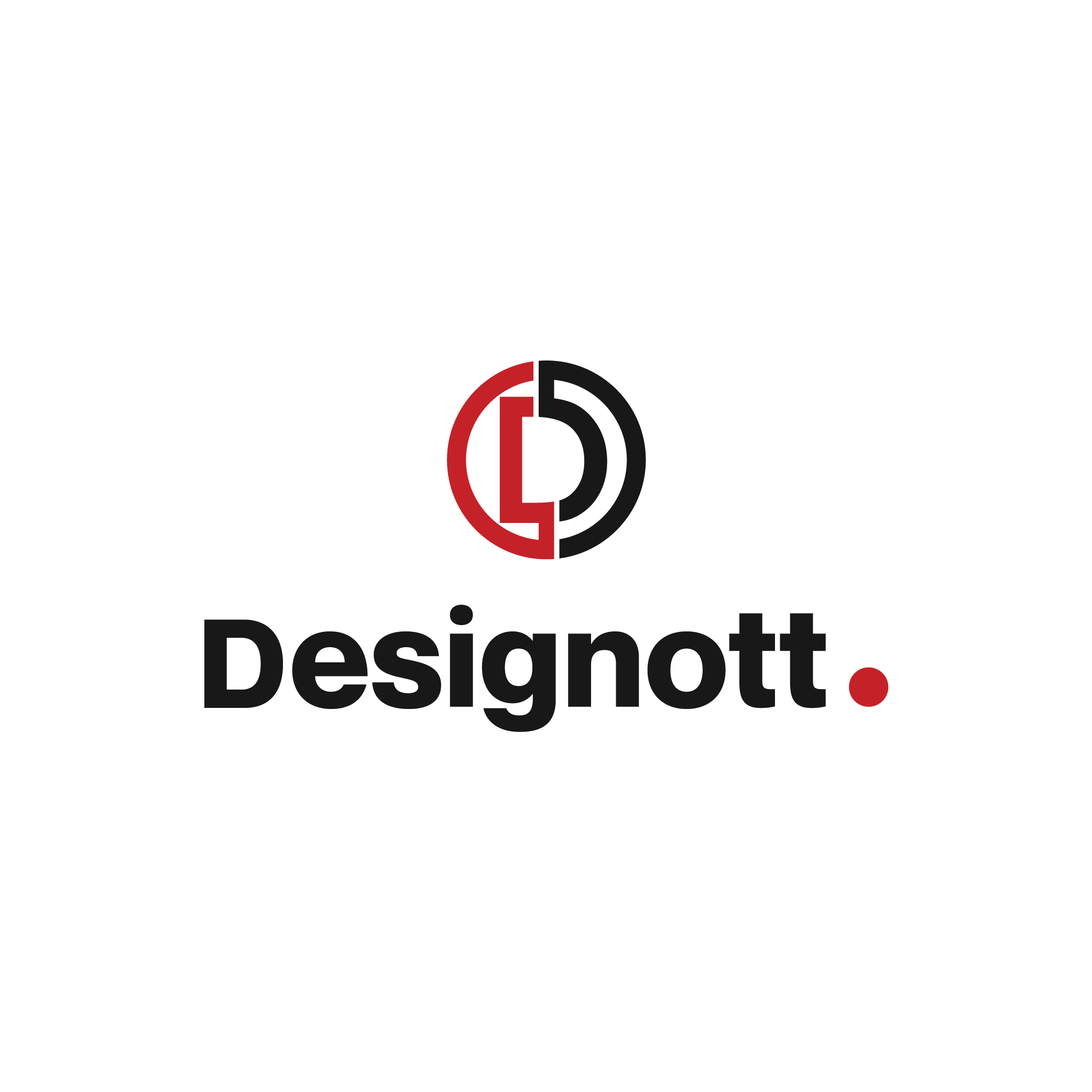
Our logo reflects all of this.
The wordmark ends in a red “dott”—a visual full stop.
The monogram D is split with red on the left and black or white on the right, balancing impact with order.
Our color palette is bold: red, black, and crisp white. No gradients. No soft edges. Just confidence.
We treat design like punctuation—you don’t overuse it. You use it to say something that matters.
Designott ends the sentence.
We don’t just deliver work. We close it—loud, sharp, and unmistakable.
If that sounds like too much, we’re not for you.
But if you want your brand to make a point—well, now you know where to end it.
Thanks for putting in the effort to write this.