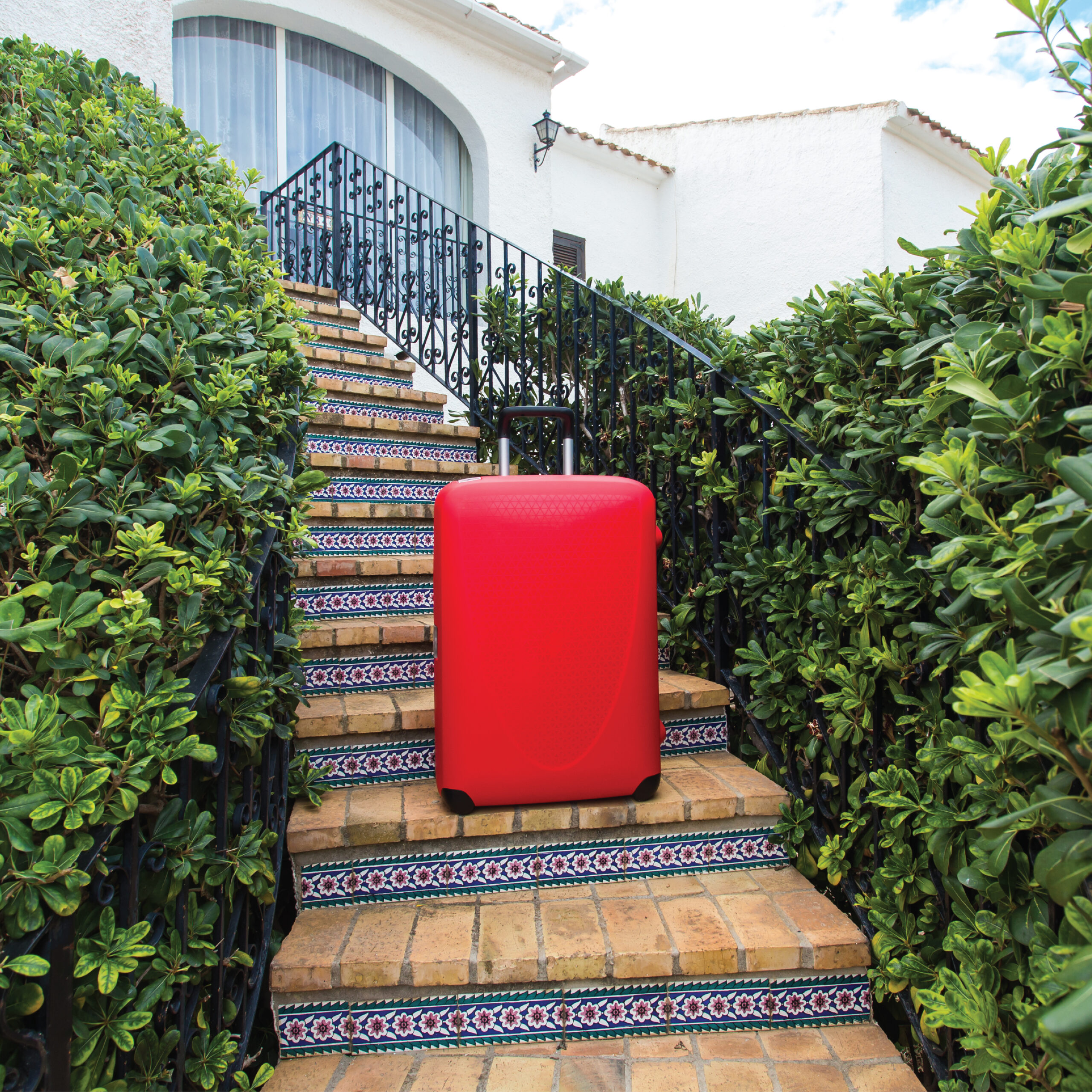
Why Red? Because You Can’t Ignore It.
Some brands whisper.
Some brands suggest.
We don’t. We demand.
At Designott, red isn’t a color—it’s a signal.
It tells you we’re here.
It tells you this matters.
And it tells you to stop scrolling, stop walking, and start paying attention.
Red Grabs First, Thinks Later.
There’s a reason stop signs are red.
A reason emergency buttons are red.
A reason flags, logos, and revolution so often begin with red.
Because red makes your eyes move before your brain does.
And in a world flooded with content, distractions, and nice safe neutrals, red cuts through.
Red Is Not Polite—And That’s the Point.
Designott doesn’t aim for soft.
We don’t blend in. We don’t sit quietly on page six.
We hit front and center—with purpose.
Red doesn’t ask for space. It takes it.
That little red “dott” in our logo? It’s not cute. It’s not decorative.
It’s the full stop. The mic drop. The message that the work is finished—and it doesn’t need approval.
Red Is Risk. And That’s What Makes It Right.
Brands that use red right are brands that aren’t afraid of reaction.
Red gets noticed, but more importantly—it gets remembered.
It’s bold.
It’s urgent.
It’s human.
And when used with precision, it becomes iconic.
Why Red? Because It Works.
Red is the lead accent in our identity because we don’t shy away from clarity.
We use black for structure.
White for space.
And red for impact.
Designott doesn’t just design with red.
We design around it.
We build clarity so the red can strike. And when it does—you feel it.